
Changing the button colour is rarely the best place to start when you want to optimize landing page conversions. A polished redesign won't resolve a mismatched offer, an unusable form or a campaign that attracts the wrong visitors. It can also make results harder to interpret if you change everything at once.
Treat optimization as a measured process instead: establish a segment-level baseline, identify the obstacle closest to the buying decision and test a specific fix. More submissions aren't automatically better results. The useful question is whether the page produces more qualified enquiries, completed sales or profitable customers.
Table of Contents
- Set Up Measurement Before You Change Anything
- Compare Your Baseline With Realistic Benchmarks
- Fix Message Match and the Call to Action First
- Speed and Mobile Fixes Ranked by Impact
- Accessibility Problems That Cost Form Completions
- Run One Test and Keep Only Wins That Hold
Set Up Measurement Before You Change Anything
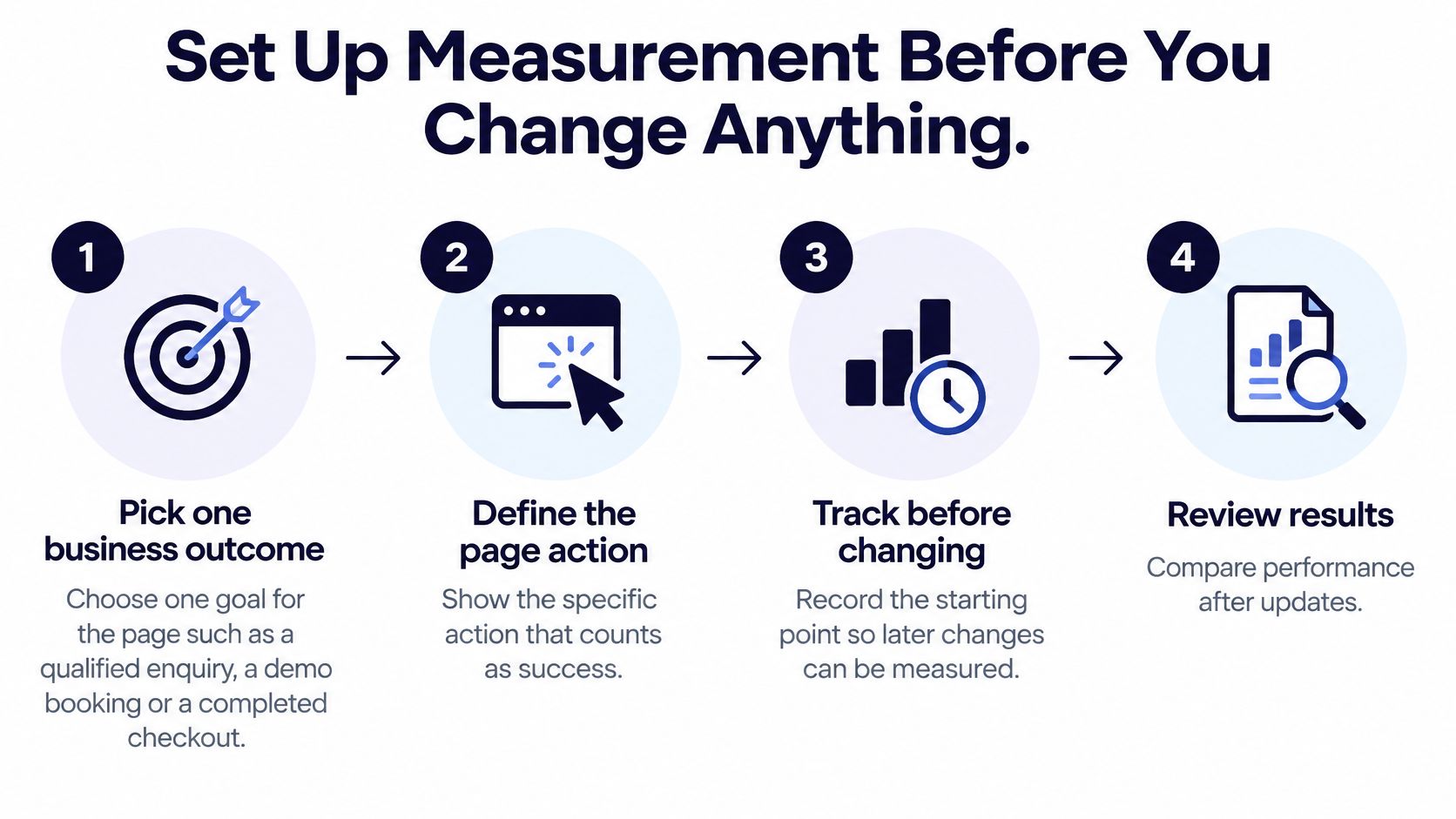
Start with a measurement setup you can trust, not a list of design opinions. Give the campaign owner, analyst and sales team the same definition of success before anyone edits the page.
Build a usable baseline
Pick one business outcome. Choose a qualified enquiry, a demo booking or a completed checkout, and document what qualifies. Counting button clicks and enquiries together makes a page look productive without showing whether it generates business.
Track the complete funnel. Record landing-page views, form starts, submission attempts, successful submissions and confirmation states. Tracking only the submit button misses failed requests, so verify success against an accepted submission rather than a click.
Separate meaningful audiences. Break results down by device, country, traffic source and new versus returning visitors, adding language where relevant. A blended improvement can conceal a failing market, but excessively narrow segments leave you with too little evidence to act.
Record the starting position. Include weekdays and weekends and continue until you've captured a representative traffic cycle. Don't compare an ordinary baseline with a promotional period unless the experiment accounts for that difference.
Predefine the experiment. Set the minimum detectable effect, required sample size, 95% confidence threshold and 80% statistical power, consistent with Falia's experimentation guidance. The detectable effect defines the improvement worth finding, confidence governs false-positive tolerance, and power describes the chance of detecting that improvement; stopping at the first significant reading increases false-positive risk.
There's no defensible universal sample size. Use a sample-size calculator with your observed baseline and chosen detectable effect, then assess whether your traffic can support the experiment. If it can't, choose a more substantial hypothesis rather than pretending a small wording change will yield a reliable answer quickly.
Reconcile before experimenting
Our analytics is built in, first-party and consent-aware, so merchants can see visitors, conversions and customers without adding a third-party tracker. The Analytics & reports area has 16 features.
Use our guide to first-party analytics without third-party trackers when planning collection. For additional optimization ideas to turn into hypotheses, Sprints & Sneakers' landing page optimization insights provide a useful companion.
Tracking gate: Visits, conversions and mutually exclusive segment totals should reconcile on the dashboard before a test launches.
Investigate duplicate events, missing campaign parameters and inconsistent reporting windows when totals disagree. Don't use an experiment to compensate for tracking you haven't validated.
Compare Your Baseline With Realistic Benchmarks
A benchmark helps you ask better questions. It doesn't tell you what your page must achieve, particularly when another business counts a download as a conversion and you count a completed purchase.
The industry and device references below come from the 2024 benchmark summarized by Digital Applied, which analyzed more than 41,000 landing pages, 464 million visitors and 57 million conversions. The email figure is the 19.3% average conversion rate for email-referred visitors in Unbounce's research summarized by MarketingProfs.
Landing page conversion benchmarks to compare against
| Benchmark | Reported value | How to use it |
|---|---|---|
| All-industry median landing-page conversion rate (2024) | 6.6% | Reference point for any page, not a target |
| SaaS median | About 3.8% | Compare only with other SaaS pages |
| Entertainment median | About 12.3% | Shows how far sector baselines can differ |
| Email-referred visitors, average conversion | 19.3% | Split traffic by source before judging a page |
| Share of visits on mobile | 83% | Review mobile results first and separately |
| Desktop vs mobile conversion | Desktop 8% better on average | Expect a mobile gap and measure it, not hide it |
Medians and averages aren't interchangeable. Neither should become a promised outcome for your campaign.
Say a retailer sends an email to existing customers while also running paid search for unfamiliar shoppers. The combined conversion rate might look healthy even when paid-search visitors abandon the page. Comparing that combined rate with a global benchmark won't reveal the campaign that needs attention.
Make the audit verdict specific:
- Record the rate: List conversions and eligible visits for each page, traffic source and device.
- Name the conversion: State whether success means purchase, qualified lead, registration or download.
- Flag meaningful gaps: Prioritize segments with enough traffic to evaluate and a commercially important shortfall against comparable references or their own historical performance.
A dealership's test-drive enquiry and a manufacturer's technical quote request involve different commitments. Treat sector benchmarks as context, then investigate the visitor's intent, the offer and the point of abandonment before changing the page.
Fix Message Match and the Call to Action First
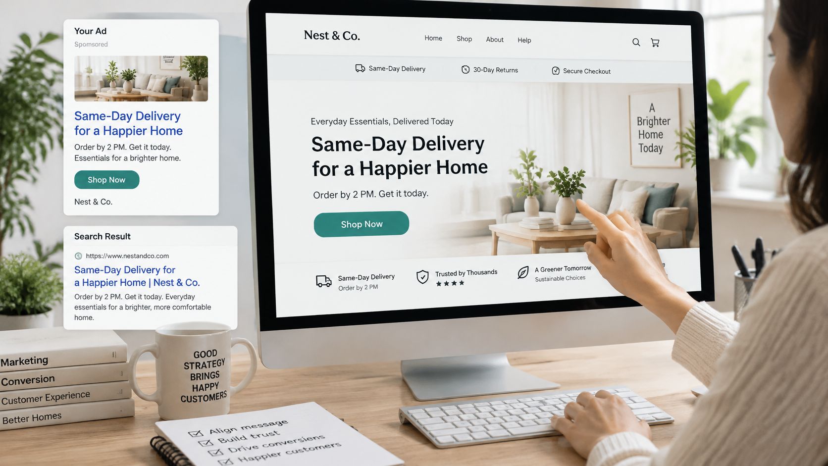
Match the headline to the promise that earned the click. If an ad offers same-day delivery on linen dresses, a landing page opening with a vague brand slogan forces visitors to confirm the offer themselves.
Replace the slogan with the actual offer, but only if the delivery promise is accurate for that visitor's location. For teams reviewing multiple campaigns, Polish campaign message matching offers a focused resource for examining the relationship between campaign messaging and destination content.
Make the next action obvious
Replace competing actions with a dominant next step. A dealership page shouldn't give equal prominence to its newsletter, finance guide and test-drive form. Make booking the test drive the primary action, while keeping necessary model specifications and trust information available.
Then inspect the form field by field. A test-drive enquiry might need a name, contact method, preferred model and location, while a B2B quotation may require specifications or a drawing. Remove fields that nobody uses before responding, not fields that determine whether the request can be fulfilled.
Move decision information beside the button. Instead of putting delivery restrictions in a distant footer, place the relevant delivery terms beside the purchase action. Replace a generic reassurance badge with clear information about returns, privacy or what happens after submission.
There's a trade-off: shortening a form can increase submissions while leaving sales staff unable to qualify them. Decide what information is essential with the people who handle enquiries, then evaluate the resulting leads rather than celebrating completion alone.
Rewrite for comprehension
The benchmark discussed in systeme.io's landing-page optimization guide reported 11.1% conversion for pages at approximately a fifth-to-seventh-grade reading level, versus 7.1% for eighth-to-ninth-grade complexity. That's an association, not proof that simplifying vocabulary alone produces the difference.
Replace abstract claims with answers. A supplier can change copy about procurement solutions to a direct explanation that buyers can upload a drawing and request a quote. Keep necessary technical terms, but explain their implications for the buyer.
Our guide to user interface design in e-commerce provides context for arranging those answers around the buying task. On our platform, pages are built by stacking ready-made sections, filling them in and publishing, without a developer.
A new visitor should be able to identify the offer, its relevant conditions and the next action after a brief glance.
Test those structural decisions before debating decorative imagery or button colour. Cosmetic experiments aren't useless, but they won't explain an offer the visitor still doesn't understand.
Speed and Mobile Fixes Ranked by Impact
Speed problems on a landing page fall into two groups: assets that delay the first render, and scripts that block the interaction after it. The benchmark cited by Brandywebs reported that 55.9% of tracked origins passed all Core Web Vitals thresholds, with mobile passing at about 48%, compared with 56% on desktop.
Those figures describe whole origins, not your page's conversion path. Measure the actual destination URL and every interaction required to finish, including validation and anything that happens after the submit click.
Core Web Vitals and conversion-path fixes for landing pages
| Rank | Metric or step | Good threshold | Usual landing-page cause | First fix |
|---|---|---|---|---|
| 1 | Largest Contentful Paint (LCP) | 2.5 seconds or less at the 75th percentile | Oversized hero image | Resize and compress the hero, then preload it |
| 2 | Interaction to Next Paint (INP) | 200 milliseconds or less at the 75th percentile | Third-party tags running on load | Defer or remove tags the conversion does not need |
| 3 | Consent banner blocking | No standard threshold | Scripts waiting for consent before the page responds | Load page content and the call to action before optional scripts |
| 4 | Form submission latency | No standard threshold | Slow validation or a synchronous CRM call | Trim validation scripts and confirm the thank-you state on mobile |
| 5 | Cumulative Layout Shift (CLS) | 0.1 or less at the 75th percentile | Images and embeds without set dimensions | Reserve width and height for each image and embed |
The order reflects how often each fault decides a landing-page completion: render delay loses visitors before they see the offer, blocked interaction loses the ones who stay, and layout shift is usually the least damaging of the three vitals. Confirm the ranking against your own field data before acting on it. A page whose form never confirms submission jumps the queue regardless of its scores.
Find the bottleneck on an ordinary phone
Start with the largest visible element, often the hero image. Check its transferred size and rendered dimensions in browser developer tools, serve an appropriately sized version and avoid lazy-loading the image needed for the initial view. Preload the confirmed critical image, not every promotional asset.
Next, inspect main-thread work. A chat widget or retargeting script loading ahead of the primary interaction may matter more than further image compression. Delay enhancements the conversion does not need and verify that the button and form respond before those enhancements initialize.
Reserve space for product cards, images and embeds. A page that moves the form while someone is tapping it stays broken even when every asset arrives quickly. Our guide to Core Web Vitals for stores connects these checks to storefront layouts.
- Check consent states: Test before a choice, after acceptance and after rejection. The page content and call to action should stay usable without loading optional tracking before consent.
- Inspect submission requests: Use the Network panel to distinguish browser validation delays from slow server responses or CRM dependencies.
- Verify confirmation: Show success only after the submission has been durably accepted, while preventing accidental duplicate requests.
Say a home-goods page loads an oversized room photograph and initializes chat before its product enquiry button responds. Test the image fix and the script deferral separately so you can identify which intervention changes usability.
Use a mid-range Android phone over a mobile connection, alongside lab diagnostics and real-user measurements. Compare equivalent campaign, country and language segments; a seasonal change in traffic quality tells you nothing about whether a faster page caused more sales.
Accessibility Problems That Cost Form Completions
Accessibility isn't only a compliance task or a colour-contrast check. A visitor may understand the offer perfectly and still be unable to select a model, attach a drawing, dismiss a consent banner or discover why a submission failed.
Landy AI's landing-page design discussion highlights the connection between accessibility and conversion-path failures. A visually cleaner redesign can make completion harder if it removes persistent labels, disrupts keyboard focus or introduces widgets that assistive technology can't interpret.
Measure where completion breaks
Compare form starts and completions across mobile and observed keyboard interactions where you can measure them appropriately. Keyboard interaction isn't a reliable proxy for disability, so combine analytics with direct keyboard and screen-reader testing rather than assigning disability labels to visitors.
Log validation failures and successful recovery without recording sensitive field contents. Compare accepted lead quality too: a form that becomes easier to submit should still collect enough information for a useful response.
Form and consent symptoms, causes and fixes
| Symptom | Likely cause | Fix |
|---|---|---|
| Keyboard users start the form but stop at a field | Missing or hidden labels | Give every field a visible label tied to its input; also inspect focus order |
| Mobile form-start rate far below desktop | Small tap targets or sticky elements covering fields | Enlarge tap targets and keep the submit button clear of overlays |
| Errors appear but users don't return to fix them | Validation messages not announced to screen readers | Show error text beside the field, associate it with the input and focus the first error |
| Consent banner cannot be closed by keyboard | Consent controls not operable without a mouse | Make accept and reject controls keyboard-operable with clear labels |
| Product or hero images carry no description | Missing alt text | Describe meaningful images and their function; use empty alt text for purely decorative images |
Treat the table as a diagnostic starting point, not a diagnosis from analytics alone. A keyboard user stopping at a field could also indicate a broken dropdown or an unexpected focus trap.
For automotive enquiries, test model selectors and date controls. For B2B quote requests, confirm that upload instructions, accepted-file guidance and upload outcomes are available without relying on visual changes alone. On multilingual product pages, check language settings and translated validation messages as well as body copy.
Release check: Complete the journey using only a keyboard, then repeat it with a screen reader such as NVDA or VoiceOver.
Note every point where you can't tell what happened or what to do next. Repair known access failures directly, then monitor completion and lead quality to catch regressions without leaving an unusable control in place for an experiment.
Run One Test and Keep Only Wins That Hold
Turn a proposed fix into a hypothesis that names the change, the reason and the expected business result. For example: placing the delivery promise beside the enquiry button should increase qualified paid-search enquiries because visitors need to confirm delivery eligibility before submitting.
Launch only when the sample requirement and stopping rule are documented. Keep traffic allocation stable and record concurrent campaign or offer changes so they don't become invisible explanations for the result.
Use a business decision rule
Keep the variant only if it improves the primary outcome without materially worsening lead quality or the downstream measures relevant to that page.
Those guardrails may include sales completion, refunds, revenue per visitor and error rates. Define acceptable deterioration before launch rather than inventing an exception for a variant you prefer.
A fashion retailer might receive more enquiries after making a delivery promise more prominent, then discover that customers in an ineligible market misunderstood it. That isn't a clean win: correct the market-specific wording and retest instead of rolling the variant out everywhere.
Validate a winning variant during a later traffic period and inspect device and locale results before broad deployment. An isolated campaign improvement can justify a campaign-specific page without justifying a global change.
On our dashboard, visits, enquiries and quote requests appear together. Use those records alongside sales and returns outcomes to decide whether the change deserves to stay.
This week, choose your highest-traffic landing page, select a message-match fix and write its hypothesis. Calculate the required sample, assign an owner and launch only when the tracking checks pass.
CIQRA offers section-based website building and built-in, first-party, consent-aware analytics, helping teams connect page changes with measurable outcomes. Visit CIQRA to explore a shared platform for your company website and online store, and start with a landing page whose performance you can measure.