
In the fourth quarter of 2025, e-commerce accounted for 16.6% of total U.S. retail sales, about $316.1 billion against roughly $1.900 trillion in total retail sales, according to the Census Bureau quarterly retail estimate. Online sales rose 5.3% from the same quarter a year earlier. Total retail sales rose 2.7%.
That share is large enough to matter and small enough to keep you honest. When you create an online shop, you are not finishing a design project. You are choosing which orders you can win, ship, and take back without giving the margin away. A clean theme will not rescue a market you cannot deliver into, a returns promise that costs more than the product, or a checkout a shopper cannot finish.
Pick one market where people already buy online. Price delivery and returns against contribution per order. Build the path so a stranger can buy and send something back without emailing you. Then stay closed until that path works.
Table of Contents
- Confirm Demand and Pick Your First Market
- Plan Your Catalogue, Delivery and Returns
- How to Build Your Store in Seven Steps
- Make Checkout and Pages Fast Enough to Convert
- Go Live Only After the Checks Pass
Confirm Demand and Pick Your First Market
Start with a market you can serve profitably. In Eurostat's 2024 survey, 77% of EU internet users said they had bought or ordered goods or services online in the previous 12 months, up from 59% in 2014. That broad demand does not mean every country is a good first choice.
| Market | Internet users who bought online (2024) |
|---|---|
| EU average | 77% |
| Ireland | 96% |
| Netherlands | 94% |
| Denmark | 91% |
| Italy | 60% |
| Romania | 60% |
| Bulgaria | 57% |
Ireland, the Netherlands and Denmark had the highest shares in this table. Bulgaria had the lowest, while Italy and Romania each recorded 60%. Use these figures to shortlist markets, not to predict your sales. Choose a country where you can communicate clearly, accept payment and meet delivery expectations at a cost your margin can absorb.
Check the buying experience before you commit. Compare competitor stores in your chosen market: note their product range, delivery promises, return terms and payment methods. Then identify a specific gap you can fill without pricing yourself out of the market. For a print-on-demand idea, print on demand niche validation can help assess the niche before you commit to designs.
Language and currency affect whether a shopper understands the offer and its price. Start with the language and currency your first market expects, and confirm that your delivery options work there. Expand only when sales justify the added operating work.
Launch with one market, one language and 20 to 50 products. Keep the first catalogue focused enough to learn which products sell, then add products or markets when demand supports the cost.
Plan Your Catalogue, Delivery and Returns
Decide what you will sell, and what it costs to ship and take back, before you pick a theme. Group products so size, variant, and attribute data are complete. Missing details create returns you could have avoided.
The DHL e-commerce trends report is blunt. 81% of shoppers abandon a cart when their preferred delivery option is unavailable, and 79% abandon when their preferred returns option is unavailable. 33% of shoppers will not buy from another country because of returns costs. Offer the option they expect. Do not promise that option is free in every market.
Margin rule: Easy returns means predictable, transparent, and workable in that country. It does not mean free on every SKU.
Say a 60 euro sweater carries a 12 euro return label. One remorse return takes a fifth of the selling price before payment fees and the time you spend on the ticket. A 900 euro armchair can look healthier until a damage claim, a second delivery, and a refund wipe the contribution. Same slogan, opposite economics. For each group, subtract outbound shipping, return shipping, expected refunds, payment fees, and support time from the selling price. What remains is the contribution you can keep.
Separate buyer-remorse returns from defective or legally required returns. Remorse is a commercial choice. Defects and withdrawal rights are not. Fashion size returns and furniture damage claims should not share one policy line. We let customers, including guests, request a return online and choose a reason you have defined, which keeps the method off an email thread. Ask guests to register only when you need the account for fraud control or a trade price list.
Draft one page before you build. Our ecommerce returns policy guide is the place to pressure-test the wording once the numbers are set. Use one row per product group, and repeat the row for each market if the promise changes.
| Product group | Delivery promise | Return method | Return window | Returns policy (free, paid or defect-only) |
|---|---|---|---|---|
| Apparel and shoes | Tracked delivery in 3 to 5 days | Prepaid drop-off label | 30 days | Free for size and fit, buyer pays other remorse |
| Bulky furniture | Booked slot with a date window | Carrier collection after photos | 14 days | Defect-only free, buyer pays change-of-mind freight |
| Low-value accessories | Standard parcel with a scan, no premium date | Customer-paid post or store credit | 14 days | Defect-only, because the label can exceed the item |
If a row goes negative after a realistic return rate, cut the market, the free label, or the product. Do not "fix" it with a nicer banner.
How to Build Your Store in Seven Steps
Build only what the margin page allows. The usual failure is a pretty homepage and a checkout nobody has bought through.
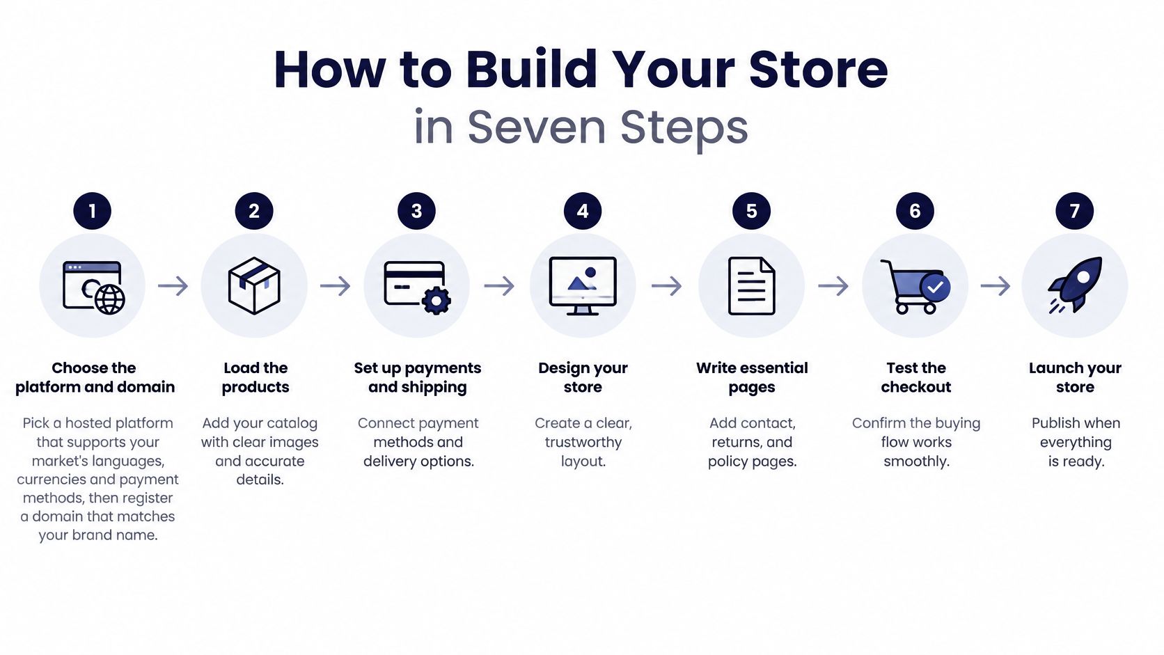
Choose the platform and domain. Pick a hosted platform that supports your market's languages, currencies, and payment methods, then register a domain that matches the brand. Set a page-weight budget the same day, before a theme adds apps you will not remove. The usual slip is choosing software because the demo looks sharp, then discovering it cannot take the wallet your buyers use. These key considerations when choosing an e-commerce platform are worth settling before you import a single product.
Load the catalogue. Enter the 20 to 50 products with titles, variants, weights, dimensions, and alt text on every image. Variant selectors, size guides, and galleries have to work from a keyboard, with a visible focus state. The usual slip is launching with "various sizes" and no weight, which breaks both shipping rates and screen-reader users.
Connect payments. Link the providers your buyers expect, on your own merchant accounts, and run a card plus one wallet such as PayPal. Name every field and every pay button so a screen reader can identify it. The usual slip is a test payment in the admin that never hits the live provider.
Set delivery and returns. Enter the rates, windows, and paid or free rules from your one-page draft, one market at a time. Do not turn on a global free-returns toggle because the theme offers it. The usual slip is a flat rate that ignores the armchair.
Publish the legal pages. Show your identity and contact details, the total price including taxes and delivery charges, withdrawal information, complaint handling, and legal guarantees. Read those pages with a screen reader before you call them done. The usual slip is a price that stays net until the last click.
Set order emails. Edit confirmation, shipping, and delivery messages so each one names the carrier and an expected date. Default templates that say "your order is being processed" create support tickets. The usual slip is leaving the platform's sample copy in place.
Place a real test order. Buy one item with a discount code, then refund it, and confirm the email, the stock change, and the money. You are finished when a stranger can find, buy, and return an item without asking you a question. The usual slip is testing only the homepage on a fast office connection.
Make Checkout and Pages Fast Enough to Convert
Draw the purchase path before you decorate it. Product discovery, product detail, basket, delivery and tax disclosure, payment, confirmation, then returns and support. Put an analytics event on every transition. Test mobile, desktop, a slow connection, and every payment method you offer.
Baymard's checkout research reports a global average cart-abandonment rate of 70.19%. It rates 65% of evaluated checkout experiences "mediocre" or worse, and only 2% "good." In its shopper research, 17% of US online shoppers reported abandoning because checkout was too long or complicated. That 17% is the slice you can fix. Much of the rest is browsing.
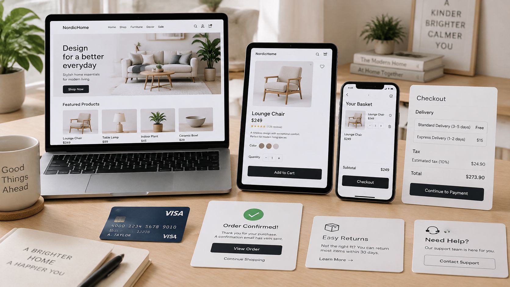
Launch only if these are true.
- Guest checkout is on, and account creation is optional.
- The total, including tax and delivery, is visible before payment.
- Forms ask for what the carrier and the payment provider need, and errors say how to fix the field.
- The basket survives a refresh and a closed tab.
- A delivery date or a clear window appears before the pay button.
After launch, split abandonment by device, country, payment method, new versus returning customer, and step. Change one friction point at a time.
Do not treat 70% abandonment as a target. Judge a change by completed orders, step progression, profit after refunds, and how many people contact you about checkout.
Speed budgets before the theme
Performance starts while you create the shop, not in a post-launch panic. Budget for responsive product images, lazy loading below the fold, few third-party scripts, cached static assets, and server-side rendering where it fits. Watch mobile Core Web Vitals against real orders, not a lab score on the homepage alone. Our notes on Core Web Vitals for stores cover what to measure on catalogue pages.
Google's mobile site speed playbook, citing SOASTA, found that pages loading in under three seconds had an average bounce rate of 13%, rising to almost 60% after nine seconds. The same playbook reported that making a mobile page load one second faster could increase conversion rates by up to 27%. Another retail study it cites linked a 0.1-second improvement to an 8% average increase in conversions and a 0.5% increase in add-to-cart counts.
| Change in load time | Reported effect |
|---|---|
| Under 3 seconds | 13% average bounce rate |
| 9 seconds | almost 60% average bounce rate |
| Mobile page 1 second faster | up to 27% higher conversion rate |
| 0.1 second faster | 8% average increase in conversions |
The order of the work
Compress and correctly size catalogue images first. Defer JavaScript that is not required to buy. Reserve layout space so images do not jump. Then cut checkout scripts that are not taking payment. Test from your main markets on cellular networks, and tie each change to revenue.
Time listings, search, product pages, the basket, and payment redirects separately. Reviews, chat widgets, analytics, and payment integrations usually cause the worst delays, not the hero image. A fast homepage with a slow pay redirect still loses the order.
Once the path is quick enough to keep, use a search marketing guide for store owners to bring the right queries to those product pages. Traffic onto a nine-second listing is an expensive way to watch people leave.
Go Live Only After the Checks Pass
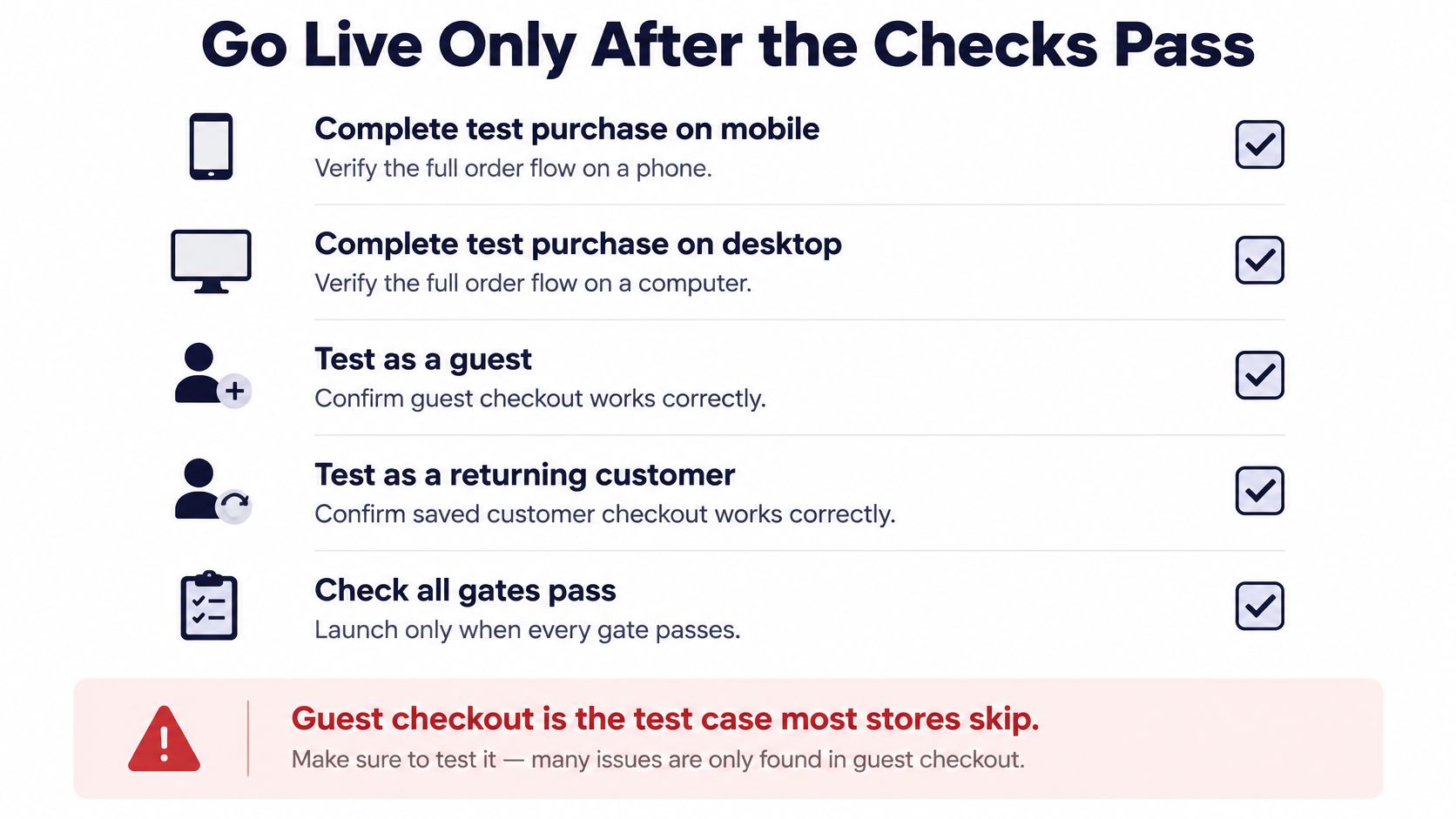
Do not open because the theme looks finished. Open when every gate passes. Run a full purchase on mobile and on desktop, once as a guest and once as a returning customer. Guest checkout is the case most new stores skip, and it is the case most first orders use. Checkout can take address, delivery, and payment on a single page, and shoppers can buy without creating an account. If your test still forces an account, you have not finished.
Accessibility is a conversion test, not a homepage badge. Variants, size guides, pop-ups, delivery choices, payment forms, and returns have to work with a keyboard and a screen reader. A 2025 Contentsquare Foundation report found that 84% of checkout pages failed the WCAG criterion on correctly named buttons and form fields. Another study in that work reported that only 11% of audited cart and checkout pages met minimum WCAG standards. Bad names also slow people on a phone, older shoppers, and anyone buying in a noisy room.
A person reviews every AI-drafted description, translation, and alt text before it goes live. Generated copy can scale a wrong size, a wrong claim, or a blank image description as fast as it scales a good one. Confirm legal pages, the delivery and return rules from your margin sheet, speed on the pay step, and analytics events on each transition. If you route more than one payment provider, read payment orchestration explained by Spell so a failed card does not dump the shopper out of the flow you just tested.
Set a review for 30 days out. Track conversion rate, average order value, repeat-purchase rate, and online revenue share against the plan you wrote, not against a vanity visit count.
If any gate fails, delay the launch. A broken checkout on day one costs more than a late opening.
CIQRA Sites and CIQRA Commerce share one admin, so you can publish the shop, run catalogue and checkout, and let guests or registered customers start a return without moving the site to another system. Use that only after one market, one returns row per product group, and a passed test order are already on paper. Visit CIQRA when you are ready to put that plan on a storefront.